
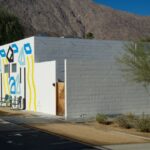
Is it the sun or the great air ? There is not only senior people rejuvenation in Palm Springs, but also economy hotels rejuvenation all around. The three last remarkable hotel renovations in the city are full rejuvenation. Old hotels have been given a second youth through design innovation, trendiness or brand integration.
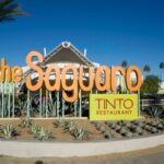
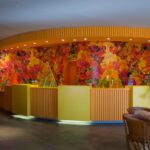
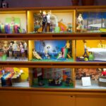
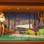
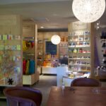
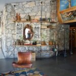
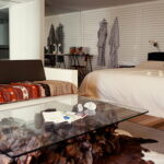
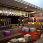
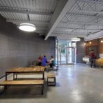
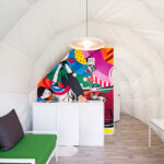
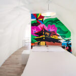
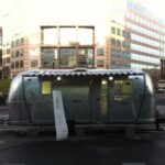
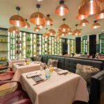
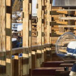
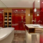
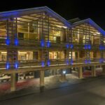
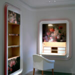
The most advertised hotel in Palm Springs lately for its innovative visual transformation, the Saguaro Hotel is a former Holiday Inn. The usual three-storey buildings with the central pool has been entirely redecorated in a colourful design by a great design . The images were already great but the experience is a success. The place adds a happy humor to the nice colours, with a Barbie directory, the Mexican menu and the trendy smiling shop.


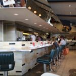
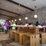
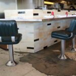
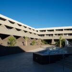
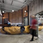
The second great rejuvenation has chosen trendiness to achieve a new life: the ACE hotel was a former Howard Johnson, with an attached Denny’s restaurant. They have chosen to create a vintage, black and white, hip atmosphere, keeping the old furniture and playing it casual in the restaurant and in the hotel with existing rooms re-organised with small room-patios and fireplaces for each block. Absolutely consistent in all elements.


The third rejuvenation is from a larger, and more upscale, hotel chain: Hard Rock Hotel has just opened its Palm Springs hotel on the basis of a former chain hotel. Again, no change in the hotel organisation and room structure; just the integration of the brand’s personality and features.


Let’s hope this rejuvenation momentum spreads around Palm Springs, so that we experience new generation economy hotels everywhere.
A summary presentation of all the trends is available on Slideshare. Just click.
Photograph/ Olivier Mordacq
—
Est-ce le soleil ou le grand air? Il n’y pas que des personnes âgées à Palm Springs, mais aussi des hôtels économiques en plein rajeunissement. Les trois dernières rénovations remarquables de la ville sont surtout des rajeunissements d’hôtels anciens, à qui des propriétaires donnent une seconde jeunesse en choisissant l’innovation design, l’univers branché ou l’intégration d’une marque nouvelle.
L’hôtel le plus publicisé à Palm Springs dernièrement pour sa transformation visuelle novatrice est l’Hôtel Saguaro. C’est un ancien Holiday Inn dont les habituels bâtiments de trois étages avec la piscine centrale ont été conservés et entièrement redécorés dans un style coloré par un grand cabinet d’architecte. Les photos sont très impressionnantes, mais l’expérience est également très réussi. L’endroit ajoute une belle humeur positive aux belles couleurs des murs, avec un guide de l’hôtel “Barbie”, un menu mexicain sympathique et une boutique de gadgets étonnants.
Le deuxième grand rajeunissement a choisi d’être branché pour commencer une vie nouvelle: l’hôtel ACE était un ancien Howard Johnson, avec un restaurant Denny’s accolé. Il a choisi de créer une ambiance vintage, noir et blanche, très tendance, en gardant les vieux meubles et en proposant un restaurant décontracté. L’hôtel a retravaillé les chambres existantes en créant notamment des patios autour des chambres et des cheminées pour chaque bâtiment. Un ensemble très cohérent.
Le troisième rajeunissement vient d’une chaîne d’hôtel plus grande, et plus haut de gamme: Hard Rock Hotel vient d’ouvrir son hôtel de Palm Springs sur la base d’un ancien hôtel. Encore une fois, aucun changement dans la structure et l’organisation de l’hôtel et des chambres; une intégration de la personnalité et les caractéristiques de la marque a suffit pour transformer l’hôtel.
Espérons que ce rajeunissement se répande au-delà de Palm Springs, afin que nous expérimentions de nouveaux hôtels économique aussi innovants partout dans le monde.
Une présentation synthétique de tendances observées lors de ce Trend Trip est disponible sur Slideshare. Il n’y a qu’à cliquer.
Photograph/ Olivier Mordacq

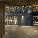
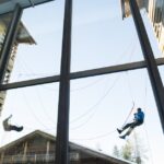
Re-using abandoned industrial sites is one of the hardest goal to achieve for cities. If turning them into museums was the first wave of evolution, other initiatives are worth our attention, such as the one presented here: the transformation of old sugar silos in Montreal in an indoor climbing club with amazing height facilities. A sensitive and successful recycling which makes perfect sense with the excessive heights in silos.
Réutiliser les lieux industriels devenus inutiles est l’un des objectifs les plus durs à atteindre pour les villes. Si les musées ont été une première vague de transformation, d’autres initiatives sont à remarquer, dont celle-ci: la transformation des silos d’une ancienne sucrerie à Montréal en un club d’escalade indoor d’une taille hors du commun. Un réaménagement réussi qui se structure parfaitement dans les hauteurs démesurées des silos. Une réutilisation parfaite.

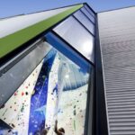
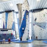
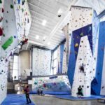
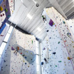
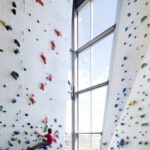
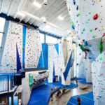
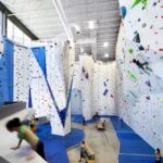
Place/ Allez Up, Montreal, Canada
Architect(e)/ Smith Vigeant Architectes
Information/ Domus

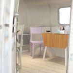
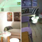
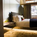
In South Korea, Glamping just got a design makeover. This truly design and glamorous campsite is situated in a remote korean countryside. It might be the inspiration for those worm-shaped tents which provide a very qualitative stay, enriched with contemporary art paintings to animate the quite white interior.
See also a very Britsh way to do Glamping.
En Corée du Sud, une nouvelle version du Glamping viens de voir le jour. Cette conception véritablement design et glamour, se cache au fin fond de la campagne coréenne. C’est d’ailleurs sans doute la campagne qui a servi l’inspiration à ces tentes en forme de vers ou de champignons. Les espaces offrent une réelle qualité de séjour et sont décorés d’oeuvres d’un artiste coréen pour animer un intérieur très blanc.
Découvrez également un Glamping au style très British.
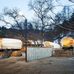
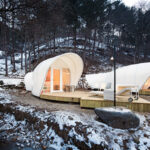
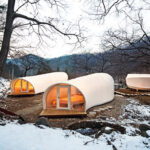
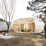

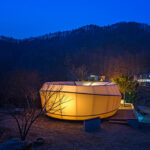
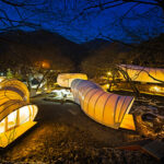
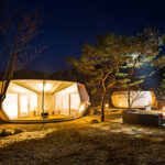

Place/ Campsite/ Camping “Glamping for Glampers”, Yang-Pyeong, South Korea
Architect(e)/ Archiworkshop
Information/ Dezeen

After the food trucks, the Nail Truck. A nice, very feminine place to accommodate a moment of hands beauty. Beyond another truck adaptation to a new use, the concept imagined by Gloss’Up combines intelligently a roaming place and the possibility to privatize the truck. Two key trends on which new Business Models are built.
Après les food truck, le Nail Truck. Un endroit tout féminisé pour accueillir un moment de beauté des mains. Au-delà de l’adaptation d’un camion à un nouvel usage, le concept imaginé par Gloss’Up mêle intelligemment l’itinérance du lieu et la privatisation, l’événementialisation possible. Deux tendances clefs sur lesquelles se bâtissent les nouveaux Business Models.


Place/ Gloss’up Nail Truck, France
Information/ Inthralld

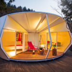
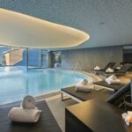
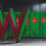
When brands are created in urban environments, they are always struggling to adapt to resort and holiday environments. With the intense urban feel attached to the W brand, it was truly interesting to discover the W in Verbier. And the result is quite impressive as they have succeeded in keeping a sleek, urban feel in the public spaces, thanks to a focus on rough material, especially stone and mineral environments. Of course the design touch is still there, but carefully balanced with swiss icons. Well done.
Quand les marques hôtelières sont créés pour un milieu urbain, elles sont toujours du mal à se transformer en resort, ou à s’adapter à un environnement de vacances. Imaginé avec la sensation intense d’un monde urbain attaché à la marque W, il était vraiment intéressant de découvrir le W Verbier. Et le résultat est assez convaincant car ils ont réussi à maintenir une sensation urbaine élégante dans les espaces publics, grâce à la mise en valeur de matériaux bruts, en particulier la pierre et les minéraux. Bien sûr, le design contemporain est toujours là, mais soigneusement équilibré et mixé avec des icônes de la Suisse ou de la montagne.
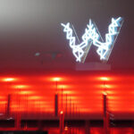


Place/ W hotel, Verbier, Switzerland/ Suisse
Architect(e)/ Concrete
Information/ Carnet de Notes

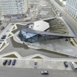
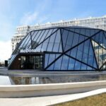
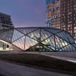
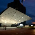
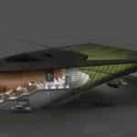
Beautiful building, isn’t it ? This is one of the new addition in McDonald’s new experiential strategy. McDonald’s has started to integrate client experience schemes (mainly interior and exterior architecture) into its development strategy. Not only are the new McDonald’s more beautiful, they also fit better with their environment and minimise their ecological footprint.
For example, this brand new McDonald’s in Batumi, Georgia, has been conceived to integrate smoothly a gas station thanks to its form and the use of water and plants as natural fumes filters.


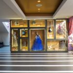
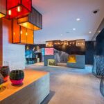
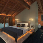
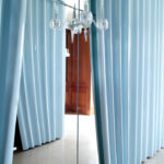
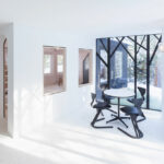
This is no contemporary art installation, but it could be. You are discovering the transformation of an Art Deco House into a contemporary urban decor. Three different areas are connected through corridors enriched with lacquered plaster curtains. The reception area showcases a “white cloud invasion” on the original wood environment. The private areas are more classical, using marble and white. For the kitchen area, the apartment transforms again into a spaceship atmosphere thanks to white lacquered wood panels. Amazing.
Ceci n’est pas une installation d’art contemporain, mais cet appartement pourrait l’être car la transformation de cet appartement Art Déco en un décor urbain contemporain est assez incroyable. Trois espaces différents sont reliés par des couloirs décorés de rideaux de plâtre laqué. Les pièces de réception donnent l’impression d’une ” invasion de nuage blanc” le long des murs en bois. Les espaces privés sont plus classiques, décorés de marbre blanc. Pour la cuisine, l’appartement se transforme de nouveau, pour proposer une atmosphère de vaisseau spatial. Un lieu hors du commun !
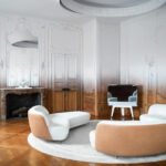

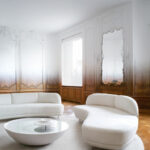

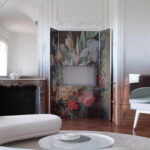
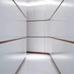
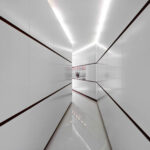
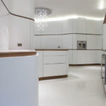
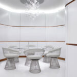
Place/ Private appartment, Paris, France
Architect(e)/ Ramy Ficshler, RF Studio
Information/ yatzer

I have already posted some example of inserted architecture (see the Italian winery or the Swiss fire station) as it is one of the greatest latest trends in experiential places. Another way to integrate naturally a place in a location is to make it an invisible part of its environment. Exactly what architects have decided to do with this lake cottage, inserting it into the landscape, thanks to its mirror facade. The pure interior decoration, seen through the windows, adds to the easiness with which it fits into the location. Only the roof reminds us that we are in front of something a bit different than the surrounding trees. Quite interesting !
J’ai déjà posté quelques exemples de ce que j’appelle des architectures insérées (tel le vignoble italien ou la caserne de pompiers suisse) car c’est l’une des plus grands dernières tendances pour les lieux expérientiels. Une autre façon d’insérer naturellement un espace dans une localisation est de le rendre invisible au sein de son environnement. Exactement ce que architectes ont décidé de faire avec cette maison au bord d’un lac, en l’insérant dans le paysage grâce à sa façade en miroir. Et la décoration intérieure , très pure, visible à travers les fenêtres, participe à la facilité avec laquelle cette maison s’insère dans le lieu. Seul le toit nous rappelle que nous sommes en face de quelque chose d’un peu différent que les arbres environnant.
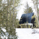
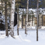
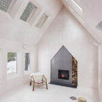

Place/ Kawartha Lake Cottage, Canada
Architect(e)/ UUfie
Information/ Ksntrct

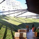
Funny mix, isn’t it? A wheat field in the middle of a strict office …
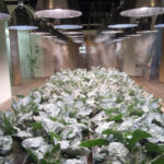
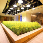
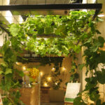
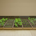
You are in the headquarters of the Pasona Group in Tokyo. In their office, a fifth of the office space is devoted to agriculture. All vegetables, fruits and rice grown on site are collected and cooked for the staff in their canteen; it is also available for every employee to better balance their diet at home. If our world becomes an exclusively urban environment by the end of the century, this initiative shows a very promising approach, demonstrating how each economic actor can participate.
Drôle de mélange, n’est-ce-pas ? Un champ de blé au milieu des bureaux …
Vous êtes au sein du siège social du groupe Pasona à Tokyo. Et un cinquième de la superficie des bureaux est consacré à l’agriculture. Les légumes, fruits et riz cultivés sur place sont récoltés et utilisés pour nourrir les employés à la cantine et sont proposés à chacun pour mieux équilibrer son alimentation chez soi. Si notre monde devient un monde exclusivement urbain d’ici la fin du siècle, cette initiative montre de façon très intéressante combien chaque acteur économique peut participer.
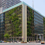
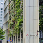
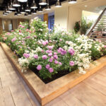
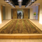
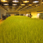
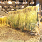
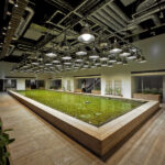
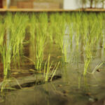
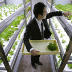

Place/ Pasona Group Headquarters, Tokyo, Japan
Architect(e)/ Kono Designs
Information/ Interesting Engineering

When retail and communication meet, it creates a billboard shop like this candy shop for the Spanish Papabubble brand in the Tokyo subway: 10 square meter of brand and candy display. They have perfectly understood that everything is communication and have turned it into design impact, avoiding totally the usual rule about display windows, and using the back wall of the shop as a gigantic billboard. Clearly a trend to watch in the retail search for better branded experiences.
Lorsque vous croisez la distribution de proximité et la communication, certaines innovations sortent du lot, comme cette boutique de bonbons de la marque espagnole Papabubble dans le métro de Tokyo: 10 mètres carrés de boutique qui affichent à égalité la marque et les bonbons. Si tout est communication, les architectes ont transformé l’essai avec la mise en place intérieure, et notamment l’oblitération totale du rôle habituel des vitrines, au profit d’une gigantesque mise en avant de la marque en fond de magasin. Une tendance à suivre dans la quête actuelle de la distribution de détail vers une meilleure expérience de marque.
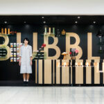
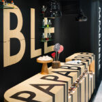

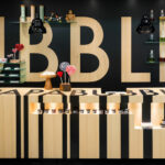
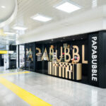
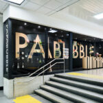
Place/ Papabubble shop, Shinjuku Station, Tokyo, Japan/ Japon
Architect(e) / Torafu Architects
Information / designboom