
Half round and light, half square and dark… this is an intriguing contrast which almost looks like two juxtaposed pictures.
(more…)
There are very few innovation in luxury retail. Unless you are Louis Vuitton. Discover “L’Appartement”.

Within the stores/restaurants family, Yuman offers a great experience. All the experience ingredients of the place are perfectly balanced: the products (100% organic, and wisely selected), the food (creative home cooking), the decoration (Michael Malapart, with a great mixing of raw materials and bright atmosphere) and the restaurant system (fixed formula at lunchtime and à la carte on evenings and weekends). Not to mention the welcoming smile of the team including Gilles Tessier, the creator of the site. Yuman presents itself as the “bright restaurant” and it does succeed to do so. Long live Yuman!
Dans la famille des épiceries/restaurants, Yuman offre une expérience tout à fait réussie. L’équilibre entre une approche des produits (bio, choisis), de la restauration (plats maison créatifs), de la décoration (Michaël Malapart, qui mélange très bien matières brutes et ambiance lumineuse) et du système de restauration (formule à midi, à la carte soir et week-end). Sans parler de l’accueil souriant de l’équipe dont celui de Gilles Tessier, le créateur du lieu. Yuman se présente comme le restaurant éclairé et c’est tout à fait bravo. longue vie à Yuman !
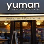
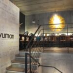
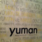

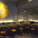
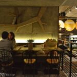

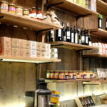
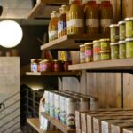
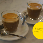
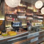
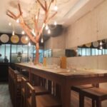
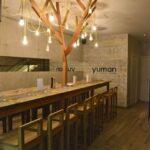

Place/ Yuman, Paris, France
Archtitect(e) / Michaël Malapert
Créateur du lieu/ Gilles

A la frontière entre années 70 et futur, vous êtes dans … un magasin de chaussures. Mais si ! Ces magnifiques vagues sont en fait les étagères qui les présentent. Le design intérieur va sans aucun doute provoquer de la curiosité. Aide-t’il à positionner la marque ou à améliorer les ventes ? C’est une autre question.
In a strange mix of 70s waves and futuristic ideas, you are in … a shoe store. Incredible, isn’t it! These beautiful waves are actually shelves that support the shoes. The interior design will undoubtedly provoke curiosity and traffic. Will it help position the brand or improve sales? This is another question.
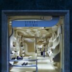
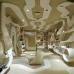
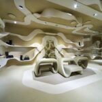
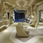
Place/ Stuart Weizman, Rome, Italie/Italy
Architect(e)/ Fabio Novembre
Information/ Contemporist

Voici un bel exemple de réalisation d’un lieu dédié à un objet, qui ne fonctionne pas. Mattel avait crée un magnifique magasin dédié à Barbie à Shanghai, mais a fini par le fermer il y a deux ans. Il faut dire que le lieu mélangeait la très riche image enfantine de Barbie à des évocations de la féminité plus adulte (dans les étages femme) qui ont, à mon avis, pesé lourd dans les ventes trop faibles du magasin. Le diaporama est parlant.
This is a great example on how you can lose your way in creating a place. This Barbie flagship store was beautiful but it mixed girly environment with more mature evocations. And its closing in 2011 is no surprise as this strange mix must have played an important role to limit the sales in the flagship. See the images to discover the too different environments.
[slideshow]
Place/ Barbie’s Flagship Retail Store, Shanghai, Chine/China
Architect(e)/ Slade Architecture
Information/ Inthralld